The Main Goal: I set out to design a mobile app that could help people seek the consistency that is so sought out today. The main functions were designed to help people stick to their long-term/short-term goals by reminding them of the big and small things that can get lost in the busyness of day-to-day life
My Why: I got the idea to create the app after being let down by what was offered to me regarding daily tracker apps and physical planners.Im someone who likes to set goals months in advance and keep track of them by checking them off in a box because it makes me feel like im staying consistent. I’ve always heard that to succeed in your goals, you should make smaller ones. When I went about tracking my goals on the iPhone reminders app, I was let down by the confusing UI. It didn’t let me interact with my goals how I wanted to, all I could do was just have reminders notify me with an exclamation point for importance. Then, I switched to the notes app. It allowed me to add pictures and check things off, but it was a hassle if I wanted to be reminded or find a page quickly among the billion different note pages I had written. That's when I decided I needed to build my own
The Daily Tracker App Of The Future
Homepage
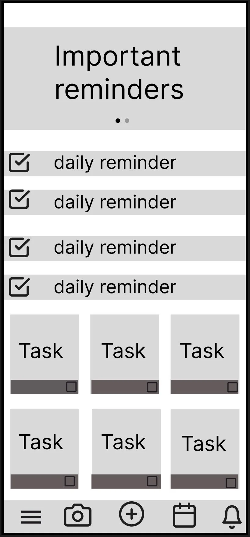
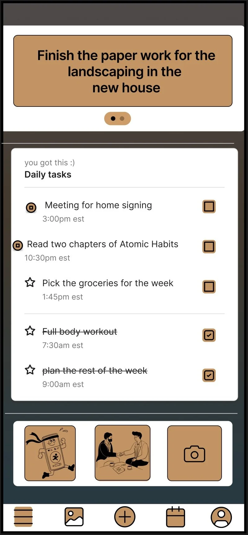
Design philosophy/Functions: I set out to design a simple layout for the homepage which mainly focused on having ease of access to all functions to make quick adds easy for the user. The main text at the top was put in to allow for important tasks to be present right away so a person doesn't get lost scrolling endlessly in their reminders app or notes app. The daily tasks app allows for tasks that are of less importance to be listed with a checkoff function to allow for a sense of relief and accomplishment when a task is completed. Photos, for ease of convenience, are listed in a row at the bottom of the screen. This was done intentionally so that when accessing something like a grocery list or parking ticket number, the user can quickly pull them up without surfing through the endless scroll of a photo library. The navigation bar was put in due to people's familiarity with using bars in other famous apps, making the learning curve easier and less like a task.
User feedback: through user studies and surveys I conducted, I asked what the most common complaints were with other daily task planners or reminders. What I received back could be simplified into two complaints. lack of interest in apps feeling like an added task to the day rather than something built for convenience and easily getting things lost due to multiple functions spread across various apps rather than one app only.
Struggles
Having too much information on the screen, overflowing the user
Lack of features to keep users engaged for more than a day or two
Overcoming Struggles
To combat an overabundance of content, I chose to remove the extra row of pictures and replace the feature with a main task list to draw the user’s eye to the valid tasks they need to accomplish during the day
To combat the lack of interest, I focused on adding multiple ways of feeling accomplished, whether it’s seeing the check or having the task crossed off it helps bring a sense of moving forward, making the tasks feel more similar to a game.
New Task page
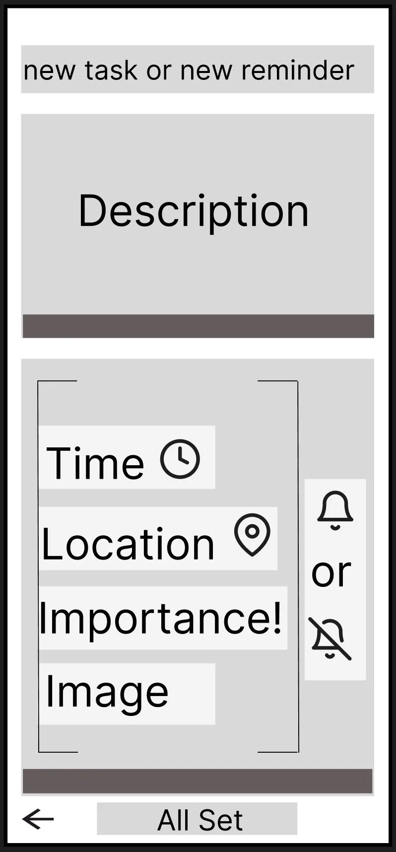
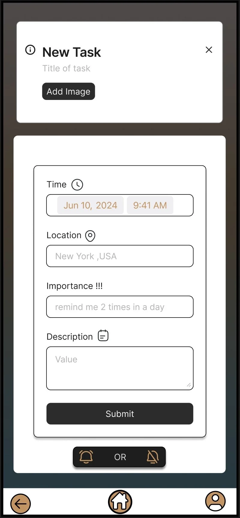
Design Philosophy/Functions: The goal of this page was to have the key functions all in the same place, including the notification bell, for do not disturb notifications to come through. I have had important moments and reminders missed because I kept Do Not Disturb on for too long, so that was a key feature I wanted to present. Even though I don't prefer using the reminders app, one feature I found that was beneficial was the importance function, which placed an exclamation point in various levels so that it would be the most vital thing to see. While I enjoyed the feature, the importance would only really be visible if the app was open and required you to find the original reminder by scrolling. I wanted my importance feature to have more functionality so that its importance would be the first thing visible when opening the app. So now when the app gets opened; the top bar will show you what you need to do right away rather than having to scroll an endless menu of old and new reminders.
Confirming Task Page
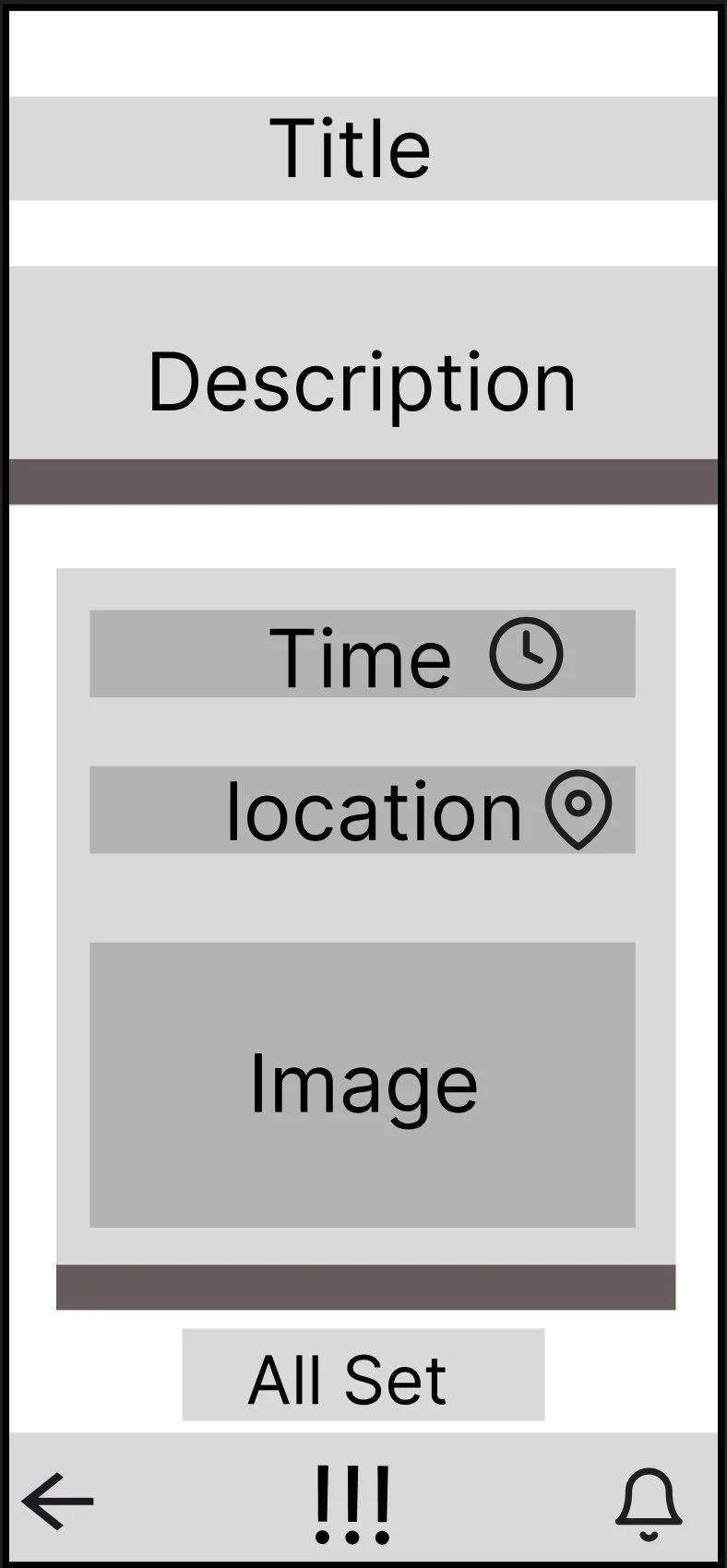
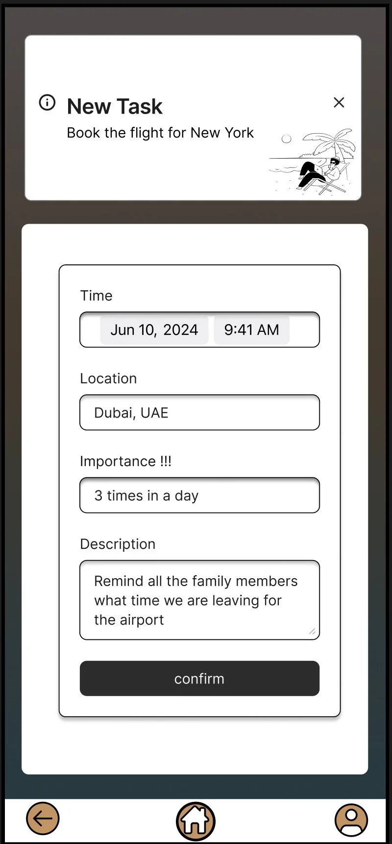
Design Philosophy/Functions: Nothing is worse than completing something and then realizing a mistake was made. There have been countless times whether in class or day-to-day life when I turned something in and then saw I made a small error such as spelling. I wanted to make sure that wouldn’t happen especially in the case of reminders that could be a job interview date. So I made sure that there were extra steps involved even if it was just one more page to look at, it would benefit the user and make them feel more secure which could lead to them having a better day or future knowing the app always has their back.
Struggles
Depicting that the sections that needed to be filled out were filled out
With the feature of adding images to reminders, I ran into issues with how to show that the right image was selected
Overcoming Struggles
To combat the struggle I chose to use two common UX design cues which were to inlay the columns and change the text color to black to add two visual ways to tell that nothing was missing.
Instead of using words to explain the image, I wanted to make sure it was visible because visual cues are more likely to be picked up on so I decided to have a small image window allowing for quick change accessibility.
Calender
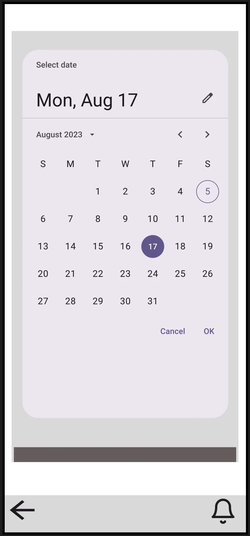
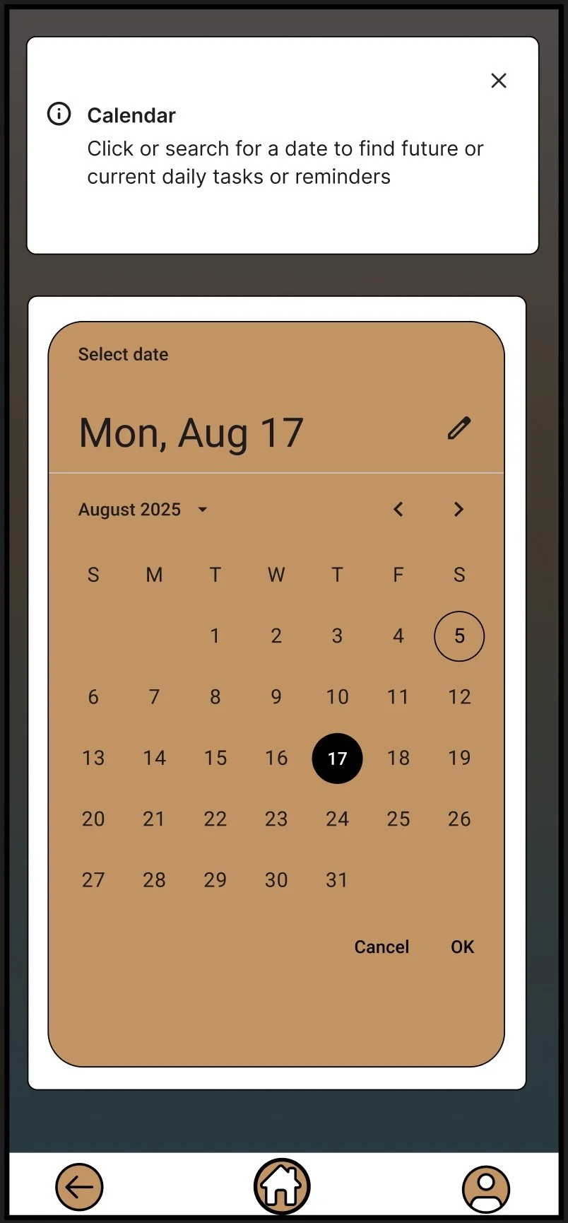
Design Philosophy/Functions: A simple feature I wanted to add because I originally built the app to help people with their goals, and I believe that for long-term goals it’s important to keep track of dates. I also wanted to make sure there were multiple ways to select a date to accompany any unforeseen circumstances that could occur across multiple devices such as a broken screen or glitchs in software. It’s better to be prepared than not be prepared at all.
Final Conformation Page
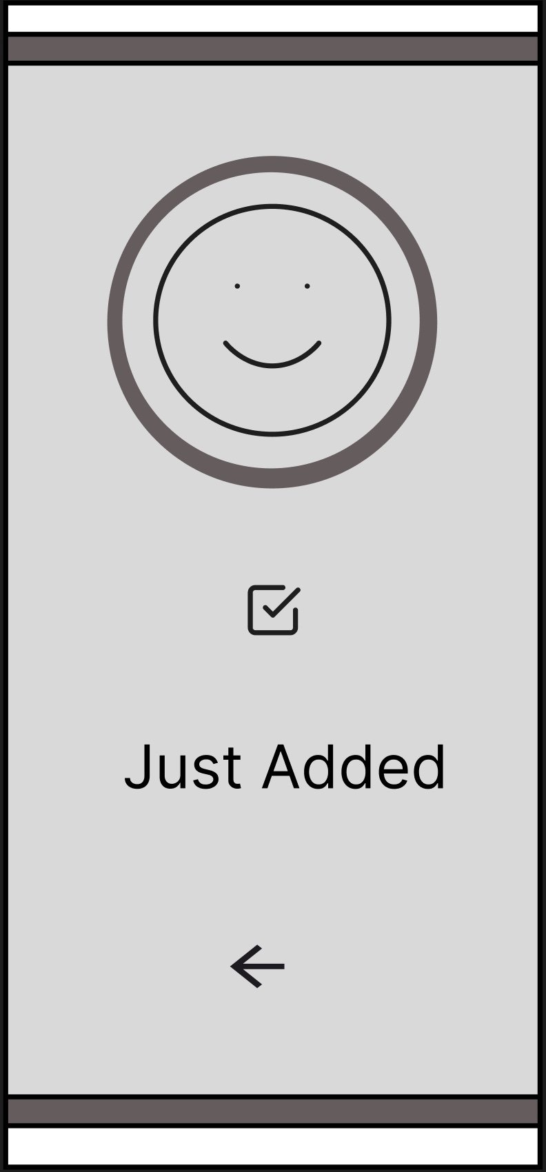
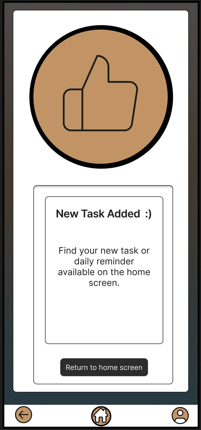
Design Philosophy/Functions: Similar to the conforming task page, I wanted to add another layer of confirmation just so the user feels an extra layer of security that the work they put into their reminder will be there when they need it to remind them. I wanted a simplistic look with added buttons to return to various pages so the tasks are available to view right away without having to fumble through multiple menus.
Miscellaneous
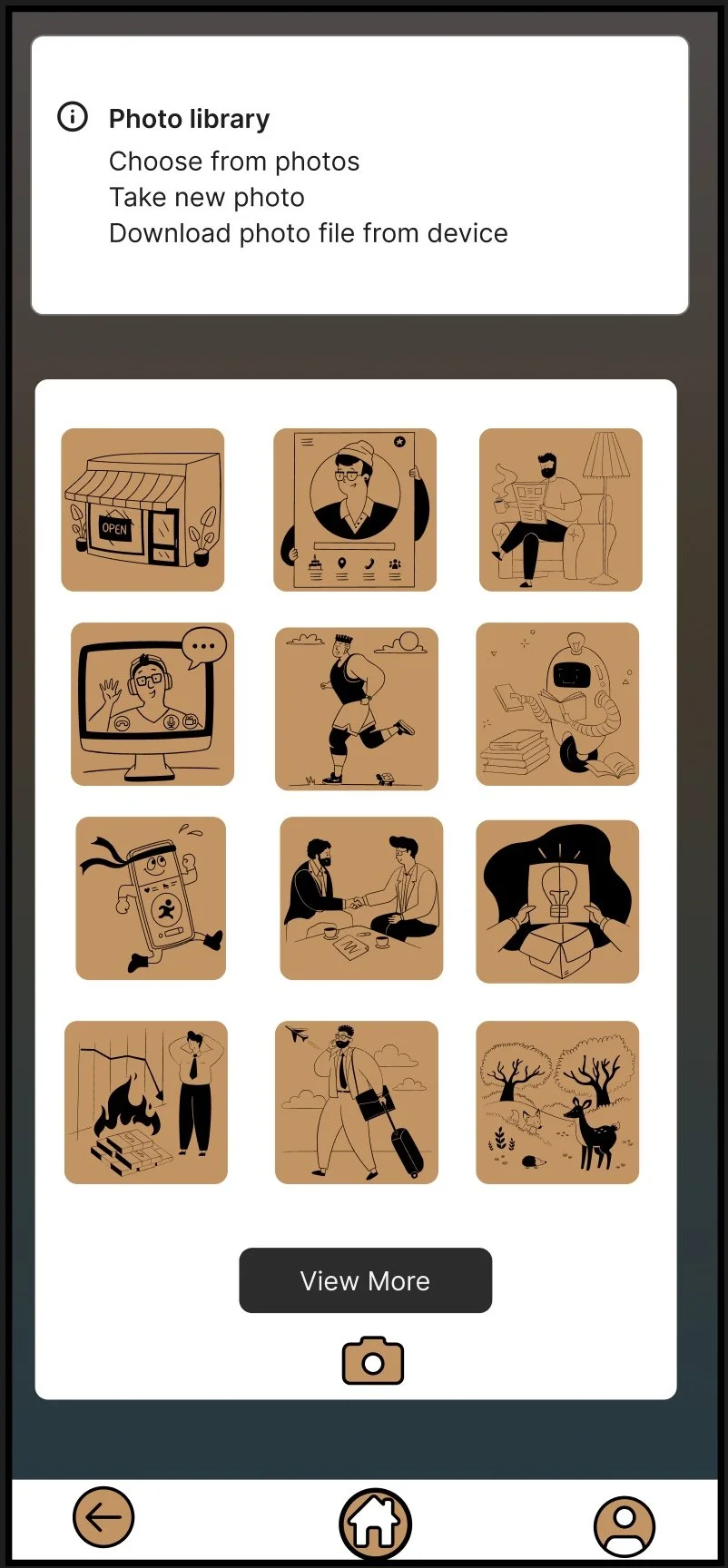
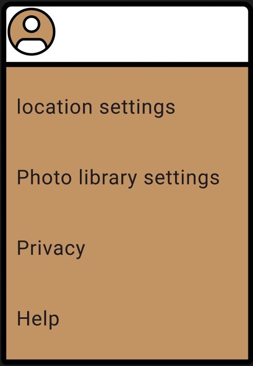
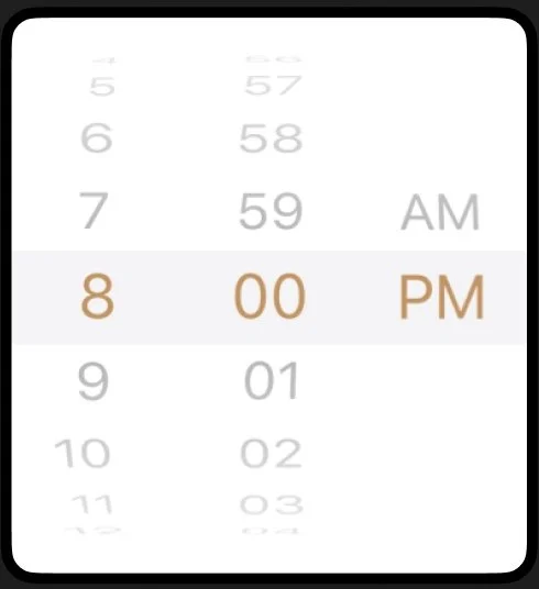
Design Philosophy/Functions: My thought behind designing these menus was that I wanted them to follow the same colors and rich feelings of tan and warmth strung throughout the app. I wanted the photo library to have the most recent pictures taken available first in the menu so they would be quickly accessible in a rush. While also including a view more link that allows quick access to the rest of the photos on the device. Following this I made sure to use a universal camera icon so someone can instantly take a photo to add to their tasks or homepage. All these miscellaneous designed functions were done so they could be accessed at all times in the app through the home page and navigation giving the functionality of an all-in-one app without having to string across multiple other apps.